

 Samantha Walls
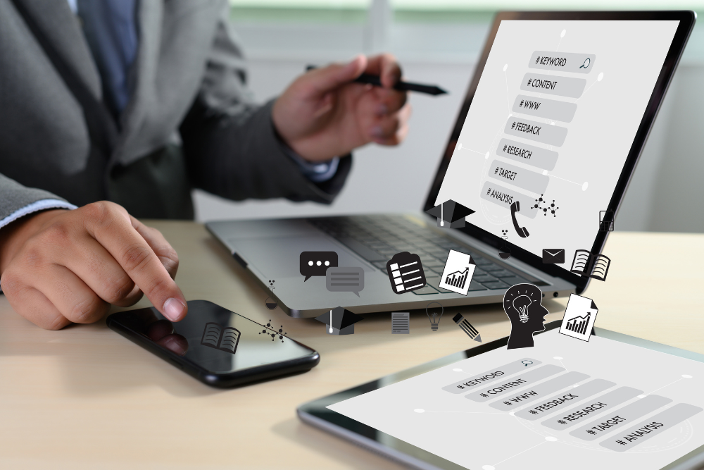
-1.png?width=300&height=251&name=Untitled%20design%20(88)-1.png) information, buying products, looking up companies and doing just about everything they do on their desktop computers and/or laptops.
information, buying products, looking up companies and doing just about everything they do on their desktop computers and/or laptops.

 aren’t missing out on opportunities to engage with potential customers. Here are 10 tips to help you get the process started:
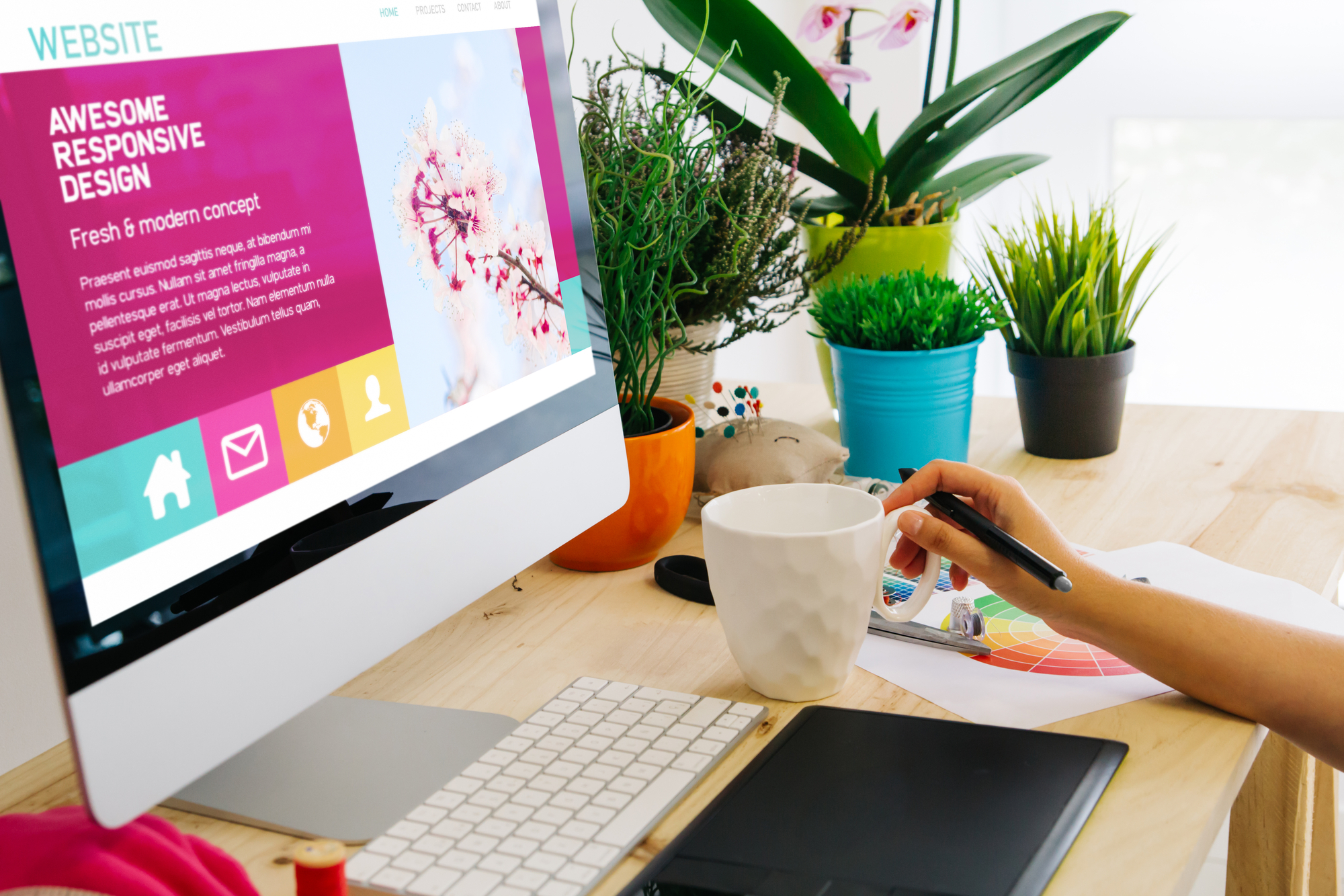
Custom Web Design Vs. Template: What Is Right For Your Business?
 Bill Walls : Jun 29, 2023 3:35:02 PM
Is your business still stuck in the digital stone age with an outdated website? It’s time to break free from the clutches of an online presence...